Posted by Nodus Labs | February 25, 2020
Sentiment Analysis using Text Networks

Sentiment analysis is used to derive meaning, emotion and intent from text-based data: customer surveys, reviews, and social media like Twitter. Most of the sentiment analysis tools are focused on categorizing the content as positive, neutral and negative, missing out the correlations and context.
However, there’s much more that can be done with advanced algorithms, such as text network analysis. Using this approach we can derive the context and correlations from our textual data and obtain a much more refined understanding of sentiment.
Below we will demonstrate how to augment your sentiment analysis research using the InfraNodus text network analysis tool.
Sentiment Analysis of Customer Survey Responses
Suppose we obtained the results of a customer survey. To provide a concrete example we will use the anonymized open ended survey responses with the improvements the users suggested for our own product.
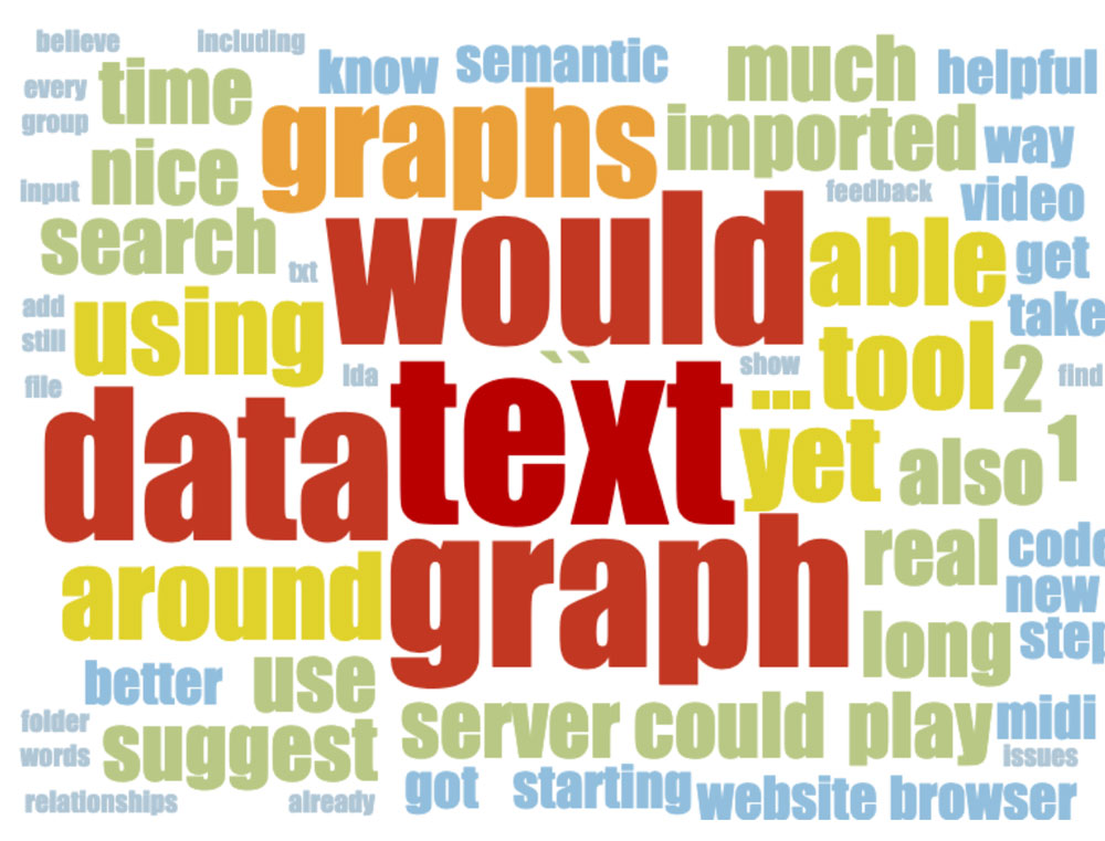
Using the standard tools all we get is a tag cloud with a minimum of options and where the context and correlations between the answers are completely lost:
We could export the CSV into a traditional sentiment analysis tool, such as MonkeyLearn. Their standard models will yield a CSV file where each answer will contain a list of keywords it contains and a negative / positive / neutral sentiment marker. Again, this is not enough.
We can improve this data if we perform text network analysis of the survey responses using InfraNodus.
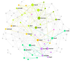
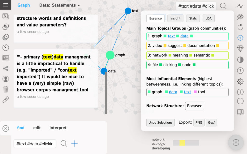
Once we add the responses into the tool (import the CSV file or simply copy and paste), we will have them visualized as a graph, where the words are the nodes and their co-occurrences are the connections between them.
The words that are more often used together in the same context are closer to each other on the graph and have the same color. They belong to the same “community” in the graph and are used for topic modeling (which you can see on the right-hand side):
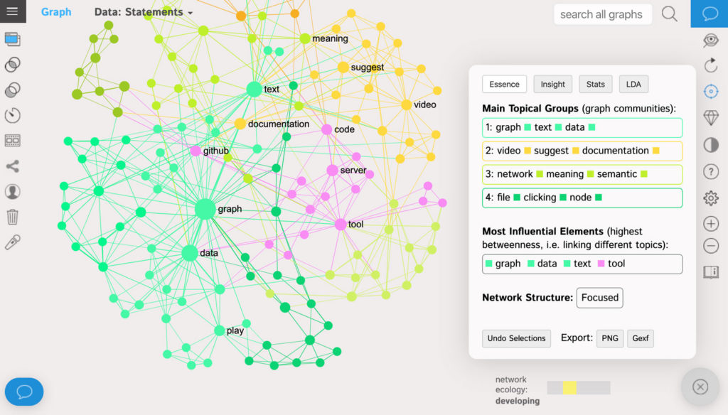
Using this graph we can immediately obtain actionable insight into the sentiment of our users.
The word-nodes are ranged by the measure of their network influence: betweenness centrality. This is not exactly the same thing as frequency: rather, the more influential nodes are the ones that connect different topics together. So, for instance, in the example above both “graph” and “data” are often used by users in their feedback even if the topics they’re talking about are quite diverse.
If we click on the nodes that they represent, we can see the context these terms appear in. Users are asking for text corpus / data management system:
The words “video” and “suggest” are the less influential words and are often used separately from the other topics, but they still form a prominent topical group (yellow) suggesting better video documentation. Another distinct block of answers suggests to add some tips that explain the meaning of various semantic network analysis measures used in the tool (light green).
Our actionable insight: create better documentation for users.
This kind of analysis goes way beyond the standard sentiment analysis tools and yields a much more precise understanding of what the customers really want.
Sentiment Analysis of Answer Correlations
Another advantage of using text network analysis is that it allows to see correlations between the responses.
Standard online and desktop tools that we use for data analysis will only yield us a general sentiment (positive / negative) and offer a bar chart with the most popular answers that will look something like this:
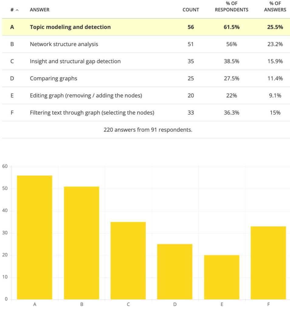
This chart shows us the most popular answers for the question: “Which features of the product you use the most?”. The users could give several answers to this question, but this information is going to be lost because we cannot see which answers co-occur together.
Using text network analysis we can get additional insights from our customers’ data. We can better understand the context for each topic that we identify in our sentiment analysis and also take correlations between the answers into account.
First, we will use InfraNodus to import the CSV file with the open answer responses where the customers list the features they like in the product. We will then get the following graph:
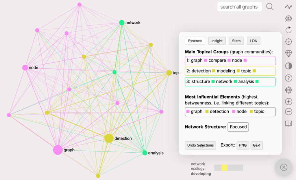
This graph also shows us (in the Analytics pane on the right) that the most popular features are “Topic modeling and detection” and “Network structure analysis”, which is consistent with our previous results.
What the graph shows us is that while these two answers are largely correlated they are still distinct from one another, so they are sometimes preferred by users independently from one another. This may indicate that there might be two different cohorts of users: those who prefer topic modeling and those who prefer network structure analysis.
Our actionable insight is that while there is correlation between “topic modeling” and “network structure analysis” they are also often required by different cohorts of users, so we could create different case studies to cater to them both.
Another interesting insight can be obtained if we represent each answer as a hashtag to get a graph of their correlations (not on the level of words but as the concrete entities):
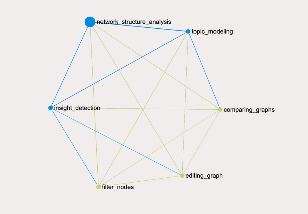
As we’ve already mentioned before, the bigger nodes on the graph are the ones that are used as connectors. What this means is that while “network structure analysis” is not the most often used feature, it seems to be often used in the answers that contain the different kinds responses. So this is an important feature to focus on in the product.
Sentiment Analysis of Twitter Data
Finally we will demonstrate how this same approach can be used to analyze Twitter sentiment for a particular topic. This approach could be used to perform sentiment analysis for a brand or a certain topic. In this example, we will study the sentiment for “sentiment analysis”.
In order to do that, we can use the Twitter visualization app of InfraNodus text network analysis tool. We will choose the import of the Tweets, which contain the term “sentiment analysis” and then see what the general picture is:
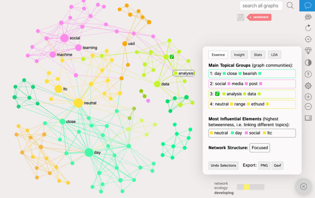
There are some distinct topical clusters on Twitter for “sentiment analysis”.
For example, the most prominent clusters are the tweets that estimate the sentiment for cryptocurrency to USD trade: “neutral”, “ethusd”, “ltc”, “day”, “close”, “bearish”.
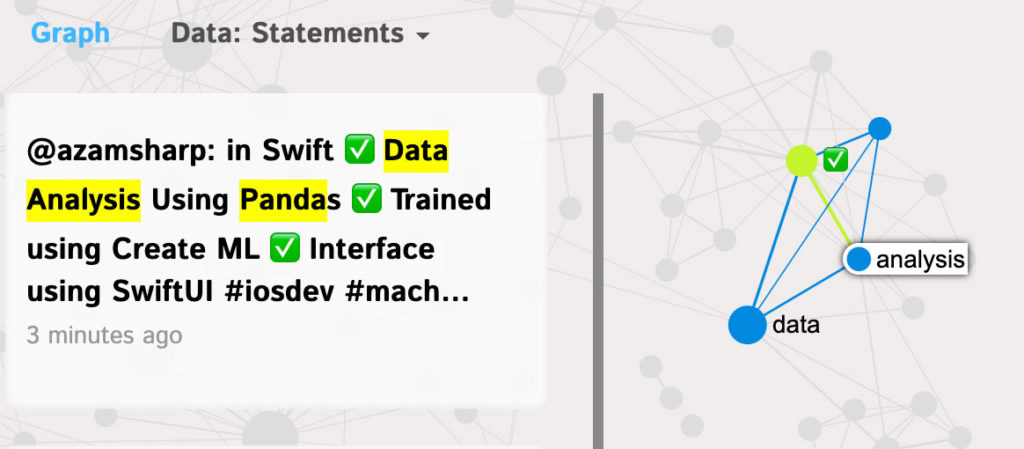
There is also a separate cluster on using “machine learning” for “social media” analysis (pink) and a more technical cluster on “data analysis” using “panda” (Python data analysis tool). We can find out what tweets the terms refer to if we click on them as you can see: