Posted by Nodus Labs | July 17, 2019
Gexf Viewer: Visualize and Share Gephi Graphs

Gexf is a graph format mainly used by the Gephi community. In the latest update to InfraNodus we have developed a special plugin that enables you to visualize, view and share gexf files, so you can publicise the results of your research and graph visualizations. This means that you can import any Gexf graph (or create your own graph) and then share it easily across any platform with a simple URL link or embed it on any website as an iframe.
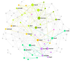
In order to demonstrate how the new InfraNodus Gexf viewer works, we will use as an example the gexf file provided in the “Human Disease Network” study, which contains information about the links between the different diseases and associated genes. To simplify, we’ve removed information about the gene associations, keeping only the connections between the different diseases. The diseases are linked together if there’s at least one gene mutation that is correlated with the both diseases.
If you would like to try it out, follow the steps below:
Step 1: Upload the Gexf File or Create Your Own Graph
You can use your own Gexf file or download the disease network gexf file here. Once you have it, log in www.infranodus.com and then choose the “Import File” app on the apps page.
Alternatively, you can also create your own graph using the graph editor, adding the nodes one by one and creating connections between them. For example, #node_1 is connected to #node_2 or simply #node_3 #node_4 (the both nodes will be added as well as the connection between them).
Select the .Gexf file option and upload it into the system.
Step 2: Visualize and Analyze the Graph
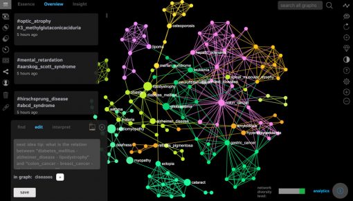
Once your graph is uploaded, it will be visualized in InfraNodus. You will see something like this:
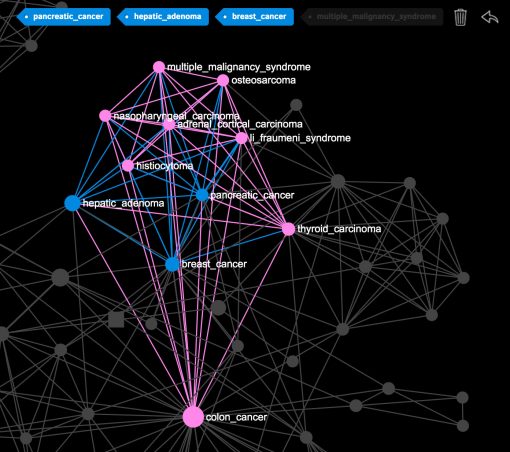
When you click on the nodes or make a search, you’ll be able to see what diseases a particular disease you selected is connected to. For example, if you select “breast cancer”, “pancreatic cancer” and “hepatic adenoma” you will see that all these diseases are linked to the “colon cancer”, which means they all share the same gene mutations:
The bigger nodes on the graph are the ones that have a higher betweenness centrality measure. You can set the ranking the show the nodes with the highest degree. We find betweenness centrality more interesting as it emphasizes the nodes that connect the different groups together. For example, in this case the most central diseases are “cardiomyopathy”, “lipodystrophy”, “glioblastoma”, “myopathy”, which means that the they share the genes with the highest variety of diseases in the network and are more likely to be connected to any two randomly chosen diseases:
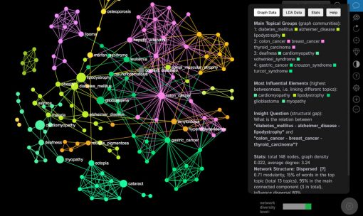
As you can see, the information is accessible in the Analytics pane at the right side, and if you scroll down you can also export the graph as a Gexf or PNG (image) file to further play with it in another software or to add it into a presentation.
The Stats panel in the Analytics pane provides all the necessary data on every node in the network.
Step 3: Export the Gexf Graph
Once you’ve finished analyzing the graph using InfraNodus, you can export it in a number of formats:
• Gexf file (Gephi and other graph analysis software)
• PNG file (image)
• CSV (data)
• Excel (data)
• URL (a link to the InfraNodus interactive graph)
• iFrame embed (to add the interactive graph to your own website or blog, like a YouTube video)
The export options are available in the Analytics pane.
If you want to export the graph as a URL or an iFrame, you will need to make it public first, using the button at the left menu:
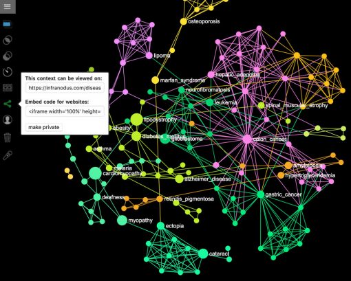
After you make the graph public, you will be able to see the URL, which you can copy and paste to share with the others, e.g. for this graph it’s www.infranodus.com/diseases/diseases
You will also be able to use the embed code, which you can copy and paste to insert to any website, just like we did below:
Additional features in the settings allow you to customize your graph and to add your company’s name, for example, or add some additional features to the graph, limit the number of nodes shown, etc.
Feel free to contact us if you need further information about this new feature or try it out on www.infranodus.com
We also recommend you to join our course on network visualization in Gephi.