Posted by Nodus Labs | February 12, 2019
Visualization of CSV / Excel Survey Datasets: Comfort Food Choices
Surveys usually come in CSV / Excel formats and network visualization techniques can be very helpful to make more sense of the data. In this short tutorial we will demonstrate how network analysis and visualization can be used to discover crucial relationships in the survey data.
We will also show how CSV and Excel files can be visualized as a network graph using InfraNodus tool in order to generate additional insights about the relationships present within the data and produce quality visuals to supplement the data.
CSV Data to Text Network Graph: How it Works
Text network analysis represents any text as a network where the words are the nodes and their co-occurrences are the relations between them.
InfraNodus can be used to create text network representation of a standard text or a CSV / tabular / Excel dataset. Its default behavior is to extract the rows from a CSV file and to visualize co-occurrences of terms in every row.
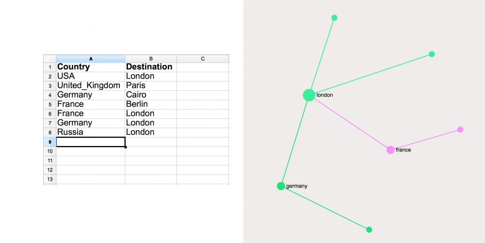
So, for example, if we have a table of the relations between a travel destination and the corresponding country of origin (data obtained from the online travel guide waytorussia.net), it would be translated the following way into the graph:
Using text network analysis on this Excel table above we can reveal the most relevant relations in our data in seconds, which can be very useful for subsequent analysis.
The more complex this data gets, the more interesting are the results — this will be demonstrated in the next sections using another example of food choices versus motivations.
Step 1: Getting the CSV Data + Defining the Objective
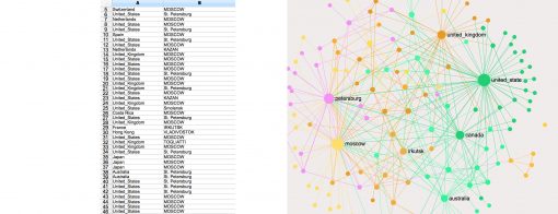
For this tutorial we will be using a CSV dataset on Mercyhurst University students’ food preferences posted on Kaggle.
This data contains information about the food preferences, diet choices, preferred comfort food, the reasons for preferring the comfort food to the other types of food, and various other parameters.
For our study we chose to focus on information about the “comfort food” (usually fast-food and greasy meals) as this is one of the major risk factors that contributes to bad nutrition. We wanted to discover the relations between the comfort food and the reasons that trigger the students to turn to comfort food instead of their standard diet choices. We also wanted to analyze if there is any relation between the students’ choices in comfort food and the food they consumed in their childhood.
So, our objectives are:
- Finding the relations between the comfort food types and the reasons for turning to comfort food
- Finding the relations between the specific comfort foods and the food consumed in childhood
Finding these relations may provide an insight to students, so that they’re more aware of the reasons behind their food choices as well as a possible connection of their comfort food choices to their childhood.
You can also use any CSV dataset of your own choice that contains textual data and follow the instructions below to extract meaningful relationships that can be visualized as a network graph.
Step 2: Upload & Process the CSV Data
- The first step is to log in InfraNodus and click on the Import File / CSV pane on the Apps page.
- We then select the CSV file and upload it on the server.
- The next step is to select which columns we want to process. The default behavior is that all the columns of the uploaded CSV file are processed, so that the data that appears in one row will be connected. For the purposes of our study (objective #1) we will limit the columns to these two: “comfort_food,comfort_food_reasons” — this way we will have a graph of relations between the different types of comfort food and the reasons for consuming this food.
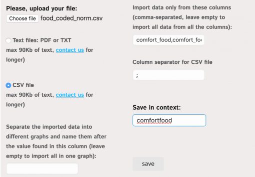
- We also need to set the right type of delimiter for the file. In this case it’s a semicolon `;`. Some CSV files use a comma “,” or a tab, so you would need to set this accordingly.
- Finally, we can specify the context / graph name where the data will be saved. In our case it’s “comfortfood”.
- We then click “Save” and the data will be visualized as a graph.
Step 3: Analyzing the Graph
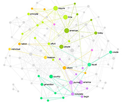
The first step is to analyze the resulting graph.
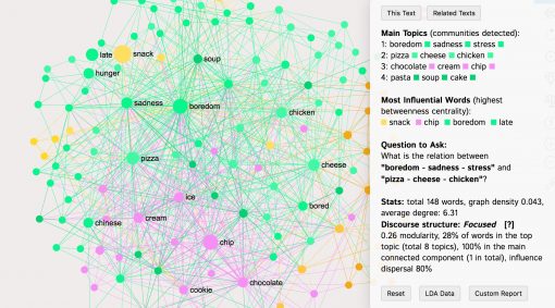
InfraNodus has a built-in analysis module, which helps identify the main topics, how they are related, and provide some statistics about the text, including the discourse structure index.
We can quickly see from the graph which terms were used more often than others (bigger nodes) and which terms were used in the same context (closer to each other on the graph indicated with a specific color).
The communities of words / nodes are separated, as could be expected, by the different types of comfort foods (eg. ice cream / cholocate — sweets — or pizza / cheese / chicken — fat foods) and by the reasons for turning to comfort food (boredom, sadness, stress).
We can then compare how different reasons for eating comfort food correlate with the types of comfort food eaten:
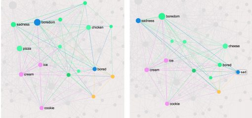
For example, the feeling of boredom or the state of being bored is closely related to the feeling of sadness or the state of being sad in terms of the food chosen. However, in case of boredom we see people resorting much more to pizza and chicken than when they sad (for which sweets seem to do a better job).
The same way we can also select a few different “symptoms” and see what kind of foods are associated with them:
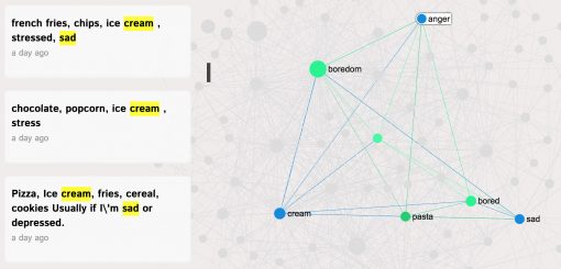
In this case we can see that when people are sad and / or angry then tend to resort to ice cream and pasta.
Knowing the implicit links outlined above can be helpful not only for nutritionists who study diet behaviors but also for the subjects themselves. As the graph above clearly shows our desires are closely linked to our emotions, triggering certain behavior through the priming network. Knowing the operational mechanisms of these links can help us detect they operation and assist us in making better choices.
The visual analysis method we presented above can be helpful to get a general impression about the data and to know which questions to ask. It can be a great complimentary tool for a different kind of statistical analysis.
Step 4: Finding Interesting Relations Between the Graphs
Moving on to the second objective we will not import the same CSV file but using the different dimensions for analysis: the comfort food eaten (column comfort_food) and the food eaten in childhood (column food_childhood).
We will then use the “Compare Graphs” feature to put these two graphs together. It works just like the “diff” feature, showing the differences and similarities between two different datasets.
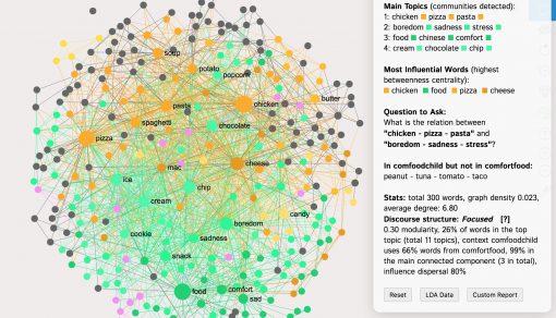
In our case we can see that 2/3 of the foods that people consume as their “comfort food” is also something they used to often eat in their childhood. This probably explains why in the state of emotional distress people tend to resort to that kind of food to fix the problem.
We can also see the types of food that people used to eat in their childhood that does not fall into the category of “comfort food”: tuna, tomato, tacos — showing the main discrepancies between the two datasets.
…