Posted by Nodus Labs | March 10, 2015
Learning to Read and Interpret Network Graph Data Visualizations

Network graphs are often used in various data visualization articles: from social network analysis to studies of Twitter sentiment. The images look very pretty and carry a lot of interesting insights, but rarely do they include explanations of how those insightful deductions were made in the first place.
In order to reap the full potential of network graphs, it is important to know the basic methodology for reading them. Like this they will reach far beyond the initial visual impact and will also serve as powerful ideation tools. Learning just a few basic concepts about graphs can help one quickly get a general overview of any multiplicity, obtain insights about communities, find the most influential nodes, and detect gaps in existing data.
If you would like to practice, you can use our network visualization tool InfraNodus and build your own graphs as you are reading this post.
Step 1: Connectivity Basis of a Graph
The first step is to decide the basis for connectivity. A network is a graph of nodes and their relations. So it is important to decide what the basis for those relations may be. For instance, when visualizing a social network one may decide that a node is a user and the relations between them are the “follow” links between those users. However, it could also be interactions or the fact that they visited the same event.
This basis will be the perspective from which the multiplicity will be studied, so it’s important to decide on the one (or several ones) that will provide interesting insights. It’s OK if it’s somewhat subjective, as long as it’s clear that it’s just a starting perspective for a further study.
For our example here we will use a text network graph of Google search results for “data visualization” query. In this graph the nodes are the words and their connections are co-occurrences of the words near each other. If the words are next to each other they are connected with a stronger weight. If the words appear in the same text snippet from search results but separated by one or two words they will also be connected, but the connection is weaker. If the words are further than 3 words from each other, they are not connected. (Read more about this the connectivity basis in our paper on text network analysis)
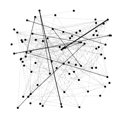
The graph above is a screenshot of the nodes and their connections randomly aligned. This sort of visualisation doesn’t really provide too much useful information. So the second step is to apply a layout that will make the graph data readable.
Step 2: Force Atlas Graph Layout and Communities
In order to make the graph readable, nodes have to be aligned in an ordered way. What this order can be depends on the goals of the study. Normally, we’re interested to know the structure of multiplicity – whether it’s comprised on many disjointed elements or if all the elements are connected to one another (i.e. belong to the giant component). Another important insight that graph layout will provide is the community structure of the graph: what are the nodes that are connected more densely to each other than to the rest of the network. Graph’s community structure will offer a good idea as to whether the multiplicity is homogeneous or heterogenous (consisting of distinct multiplicities that interact with one another).
There are many different graph layouts: Yifan Hu, clockwise layout, Force Atlas. In this example we will use Force Atlas layout algorithm utilized in Gephi graph visualization suite and also implemented in Sigma.Js javascript graph visualization library.
The basic principle of Force Atlas graph layout is that it pushes the most connected nodes to the periphery of the graph, aligning the nodes connected to them around those most connected nodes.
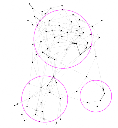
Looking at this graph we can already see the basic community structure. The nodes that are more closely connected together than to the rest of the network belong to the same “community” and we can see that there are about 3 different communities in the graph above.
To interpret this data: this graph of Google search results for “data visualization” request shows that there are about 3 different distinct groups of words that tend to co-occur next to each other. So people who use this query for search will be presented with 3 different types of material in Google.
The next step is to zoom in and analyze the actual nodes in the graph.
Step 3: Ranging the Nodes in the Graph
Right now all the nodes in the graph are the same size, so they all look the same. It’s possible to see which nodes have more connections than others, but it’s not very easy to distinguish them in the graph. So it can be useful to range the size of the nodes by the number of connections they have: the bigger the nodes, the more connections they have. We will also attach labels to those nodes, so the resulting image is much more informative.
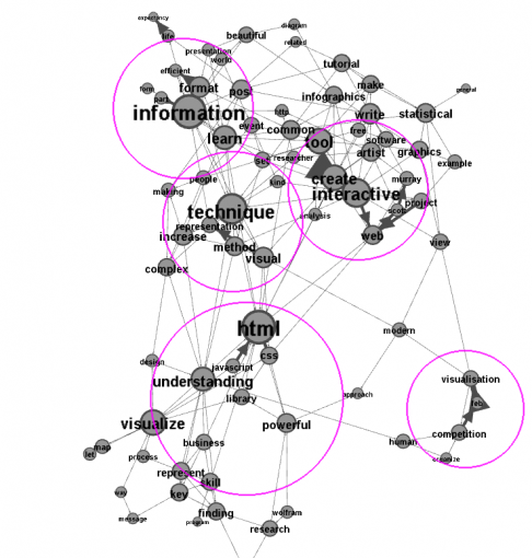
It can be seen that ranging the nodes by the number of connections they have shows the most connected nodes in the graph, or – in this example – the most prominent words in the search results. Unlike tag clouds we see those words in context – next to the other words they are used with, hugely increasing the informational value of the graph.
The most connected community at the top consists of those words, which appear together more frequently than others in Google search results for “data visualization”:
information (also: format, learn)
technique (also: method, visual)
interactive (also: tool, create)
The most connected nodes in the second community are:
html (also: css, javascript)
understanding (also: business)
visualize
And in the third community:
visualisation
competition
What this information tells us is that when people search for “data visualization” on Google they will most likely find articles about various tools and techniques for creating interactive visualizations and learning something from information they have.
Another major topic in Google search results for “data visualization” are the javascript libraries that work with html and css to visualize data.
As you can see, it’s quite a useful analysis of Google search results that can be used for SEO purposes or even for writing this very article (to know what people are searching for and what they find).
(The actual search terms, “data” and “visualization” were excluded from the graph, because they would be connected to almost all the nodes thus reducing the informational value of this image. “Visualisation”, the British spelling of “visualization”, stayed at the graph’s periphery.)
Step 4: Identifying the Gaps
Now that the most prominent topics are identified in the text, we can also see what’s missing in the data that we obtained. In order to do that we need to look between the communities and the nodes, into the gaps. They show us what’s missing, in this case – from Google’s search results for “data visualization”.
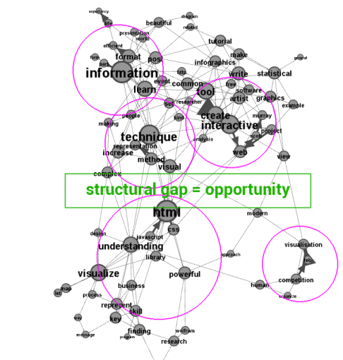
Structural gaps are the empty spaces between the clusters of interconnected nodes in the graph. Their interpretation depends on the connectivity basis used in the graph. For instance, in social networks structural gaps indicate areas for potential brokerage between different communities. In this text network of Google search results structural gaps indicate that there is a lack of articles talking both about visualization techniques as well as various specific libraries that could be used to do those visualizations. We tried to fulfil this gap by mentioning Gephi and Sigma used in this case study. However, there are many more good libraries, such as D3.js javascript library for visualizing data-driven documents and Node.XL suite for visualizing network graphs.
If you’re interested to work with social network data, you can use netvizz app that imports Facebook social graph or Twecoll to import Twitter connections.
If you are interested to work with text network visualizations, you can use InfraNodus text network analysis tool
The cover image is by Francois Morellet

