Posted by Nodus Labs | February 2, 2013
US Presidents Inaugural Speeches 1969-2013 Text Network Analysis
Presidential inaugural speeches in the US provide a good indication of the forthcoming political agenda. There has been a lot of research dedicated to this subject, however most of it focuses on keyword frequency analysis, which makes it difficult to trace the change in political agenda over the years. The reason is that the public political discourse is quite predictably dominated with such notions as “people”, “nation”, “world”. What’s interesting, however, is to detect the moments when the new notions are introduced into the political agenda, as well as to trace the change in relationships between the terms. This is where text network analysis can be quite useful, so we created a special report for The Guardian newspaper based on the US presidents inauguration speeches from Nixon’s 1969 to Obama’s 2013 address. You can see our interactive text network visualization of all the presidential speeches here and read more about the methodology below.
Created for: The Guardian
Objective: Demonstrate the dynamics of US political agenda set by presidential inaugural speeches between 1969 and 2013
Result: click here to open the interactive text network visualization
Tools: Textexture, Sigma.Js and Gephi
Dynamic Text Network Visualization – The Study of Political Manipulation
The nodes represent the words, the edges represent their co-occurrence within the texts. The closer the nodes are to each other, the more often they co-occur together. The nodes (words) that tend to belong to the same topic have the same color. The bigger the nodes, the more different topics they belong to, either because they are frequently mentioned or because they create unique bridges between the topics that they belong to.
OPEN INTERACTIVE TEXT NETWORK GRAPHS FOR EACH SPEECH IN A NEW WINDOW
Methodology
We used the method for text network analysis, which was outlined in detail in “Identifying the Pathways for Meaning Circulation” paper.
The basic premise of this approach is that every word is represented as a node and their co-occurrence within the same context is represented as an edge in the network. After a series of transformations (performed by Textexture software developed by Nodus Labs and the open-source Gephi software developed by Gephi Consortium) the graph is produced, which is then aligned according to Force Atlas algorithm. The nodes (words) that are connected (co-occur within the same context) are pulled together, while the nodes that are not connected are pushed apart (this is done using Sigma.Js javascript library developed by Alexis Jacomy).
The resulting aligned graph gives a very good representation of the major semantic fields present within the text. Furthermore, community detection algorithms are applied to the resulting network, sorting the nodes (words) into the different groups according to how interconnected they are to one another. Every community is represented with a different color. As a result, if two words co-occur often together inside the same text they will be positioned next to each other on the graph and also belong to the same community (and, thus, have the same color on the graph). These communities represent the topics inside the text. Finally, the nodes are ranked according to their betweenness centrality measure: the bigger the node, the more different communities it belongs to.

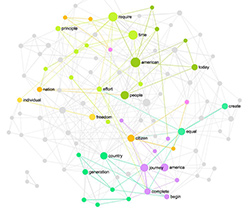
Barack Obama 2013 Inauguration Speech Text Network
It’s worth noting that such approach is very different from so-called “tag clouds”. Tag clouds show the most frequently mentioned words and they rarely position these words according to their proximity within the text. Therefore, one can get a general idea of the vocabulary inside the text, but it’s very hard to have a sense of the meaning that is produced using this vocabulary. Text network visualization, on the other hand, emphasizes both the most frequently mentioned words, as well as the relationships between them, making it much easier to understand what the text is about. Furthermore, it can also detect the topics inside the text, making it a much more useful tool for improving text comprehension and providing a much more useable interface for text navigation.
The video above demonstrates the dynamical shifts in the text network structure of US presidents inaugural speeches between 1969 and 2013. The interactive visualizations below provide a more detailed look into every single inaugural speech. You can click the links under the graphs to study each speech in more detail. Clicking on the words in the graph will produce the excerpts of the text where these words are mentioned, so you can use it to get a quick summary from the speech on the topics you’re interested in.
Nixon 1969
Notice how “peace” is an important notion in this speech.
Click here for interactive graph and visual text summary of Richard Nixon’s 1969 Inaugural Speech.
Nixon 1973
Click here for interactive graph and visual text summary of Richard Nixon’s 1973 Inaugural Speech.
Carter 1977
Notice how “war” takes place of the “peace” comparing to the previous Nixon’s speech – Carter was talking about fighting poverty, injustice and shifting from military war to diplomatic activity.
Click here for interactive graph and visual text summary of Jimmy Carter’s 1977 Inaugural Speech.
Reagan 1981
Notice how “government” becomes an important concept inside the address. Reagan famously said in this speech: “government is not the solution, it’s the problem”.
Click here for interactive graph and visual text summary of Ronald Reagan’s 1981 Inaugural Speech.
Reagan 1985
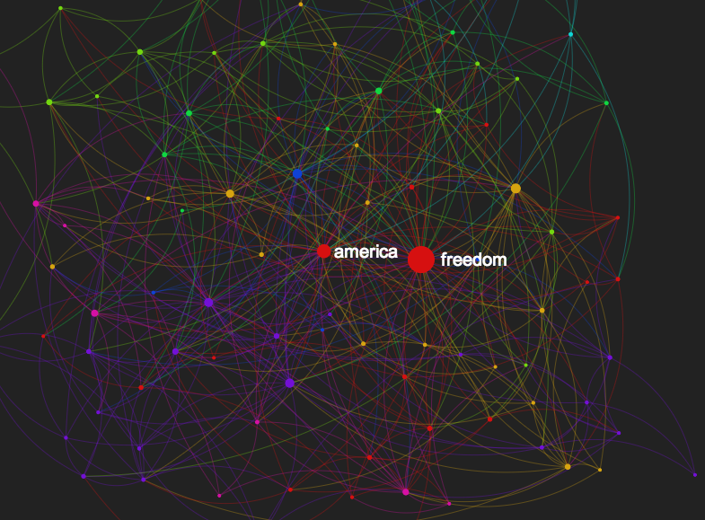
Now “freedom” becomes an important concept – a re-election trick later utilized by George Bush Jr in 2005 in a much more extreme way (see below).
Click here for interactive graph and visual text summary of Ronald Reagan’s 1985 Inaugural Speech.
Bush 1989
Click here for interactive graph and visual text summary of George Bush’s 1989 Inaugural Speech.
Clinton 1993
Interestingly enough, Clinton was the first to bring a bit more of nationalistic rhetorics into inauguration addresses: the notions of “america” and “american” have never been used so extensively before. He was also the one to introduce the notion of “change”, which was then so much used by every subsequent president.
Click here for interactive graph and visual text summary of Bill Clinton 1993 Inaugural Speech.
Clinton 1997
Now that the re-election is done, the “century” is an important concept to demonstrate the challenges ahead.
Click here for interactive graph and visual text summary of Bill Clinton 1997 Inaugural Speech.
Bush Jr 2001
Quite a generic agenda at first sight, however, Bush was the first one to introduce the notion of “time” and use it to motivate certain policies. It’s all about the Now: “In all of these ways, I will bring the values of our history to the care of our times.” Not surprising that the “story” is also such an important concept in his speech: it’s full of short stories.
Click here for interactive graph and visual text summary of George Bush 2001 Inaugural Speech.
Bush Jr 2005
The re-election is over, Bush is running the second term, probably thanks to his emphasis on “freedom” and “liberty” – a trick that always worked in the US and that was successfully employed by Reagan in his second term (see above).
Click here for interactive graph and visual text summary of George Bush 2005 Inaugural Speech.
Obama 2009
The master of rhetorics, Obama combines the best of his predecessors in this inauguration speech. No wonder the “word” has such high relevance in his speech – it refers to the moments Obama is quoting someone else.
Click here for interactive graph and visual text summary of Barack Obama 2009 Inaugural Speech.
Obama 2013
The “time” and “require” probably relates to the fact that Obama had to respond to all the criticism that something had to be done immediately about the state of US economy and politics – and he successfully addressed these concerns.
Click here for interactive graph and visual text summary of Barack Obama 2013 Inaugural Speech.