Posted by Nodus Labs | December 11, 2020
Network Analysis of Customer Product Reviews Sentiment

In this case study, we demonstrate how network analysis can be used to analyze customer product reviews.
The main advantage of visual network analysis is that it retains the context of your source data, unlike other sentiment analysis tools. So when you are looking at the main topics, you don’t only see the main keywords but also the relations between them and the rest of your data corpus.
Additionally, network analysis uses graph theory algorithms to identify the structural gaps, which can generate new product ideas.
Below we will demonstrate how it works using an example of the product reviews for a medical hardware company taken from Trustpilot.
Product Review Analysis Workflow
Step 1: Define the Objectives
We have the following objectives for this study:
- Extract general insights about the sentiment of the customers about the product using the product reviews. What are the main topics that tend to come up, how are they connected? What is the general sentiment of the reviews, and what is the structure of the discourse?
- Are there material differences between the various star ratings? 5 are best, 1 are worst, is there a difference? What makes it a 1 star? Product? Customer service? Price? Etc.
- In the middle reviews – is there something preventing a 5 star? Can we identify gaps in either product or service to move the needle from 3 to 5 star (as an example)?
- Occasionally, we’ll get a positive star, but a negative review (love the product, but customer service is off, or vice versa) – is that identifiable?
Step 2: Export the Product Review Data
You can export the product review data from Trustpilot (which was our case), from the Google Reviews API, the App Store, or the Google App store. In any case, all you need is either pure text (if you’re just interested in the reviews) or a spreadsheet table (e.g., CSV format), which also has other parameters next to the reviews (for example, the star rating or the country of the review). You can integrate those additional parameters into your analysis, which will yield more precise and layered results.
Step 3: Import the Data into InfraNodus
Use the CSV import feature inside InfraNodus to visualize the graph. Select the Product Review content column as the data to analyze and the Rating column as the category tag column — we will use this data for ranging the product reviews by the rating.
The result visualization will look like this:
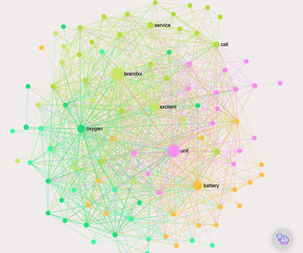
Step 4: Sentiment Overview
The first thing to do is to open the Analytics panel and to see the main topical clusters and the most influential nodes detected by the InfraNodus graph analysis system:
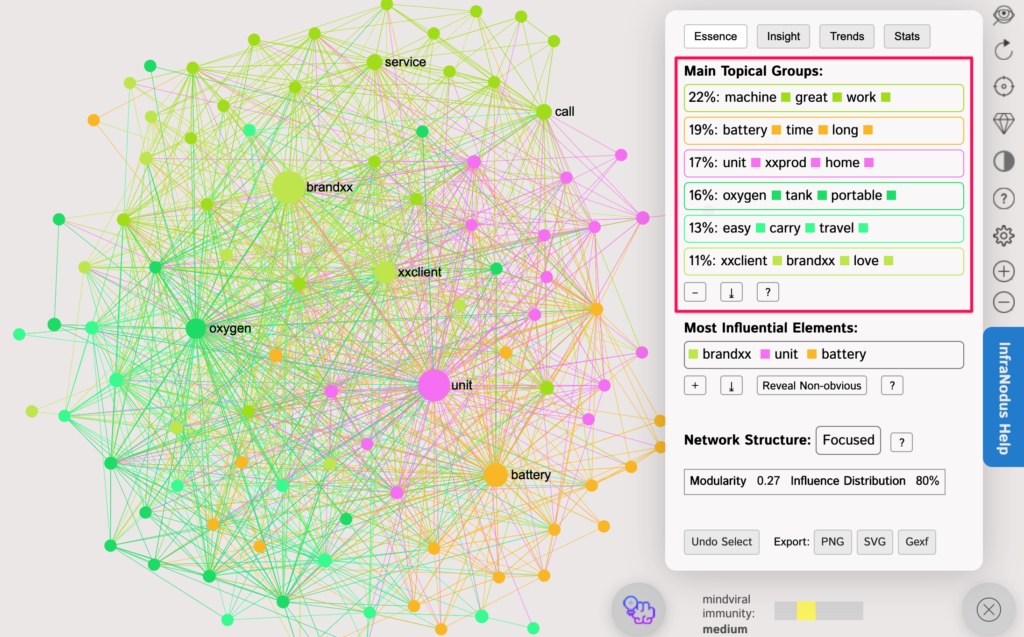
We can directly see what the most important features to the reviewers are:
• machine, great, work
• battery, time, long
• unit, xxprod, home
• oxygen, tank, portable
• easy, carry, travel
• xxclient, brand, love
These topics are clustered based on the network analysis of the underlying discourse structure. The clusters allow you to see the terms used in the same context, based on those terms’ co-occurrence in multiple reviews.
Our insights:
- In general, the product “works” “great.”
- “Long battery time” is a very important feature.
- People like to use the product at home.
- Portability and the ability to carry the device while traveling is important
- People in general like the brand
As you can see, unlike tag clouds or standard sentiment analysis tools, InfraNodus enables us to see much more than a simple “positive” / “negative” score or the most influential terms without the context. We get a very precise insight into the topical structure of the reviews and the things that are truly important to the customers about the brand and the product.
Let’s now focus on the specifics.
Step 5: Remove the Most Obvious Terms
The advantage of the network graph is that it can be used as a heuristic device to reveal hidden patterns within any discourse.
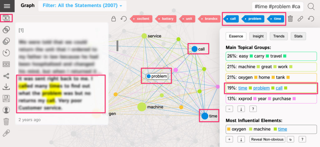
The first step is to get rid of the most influential terms to see what’s hiding behind them. Just click on the most influential nodes and temporarily remove them from the graph or use the “reveal the non-obvious” button:
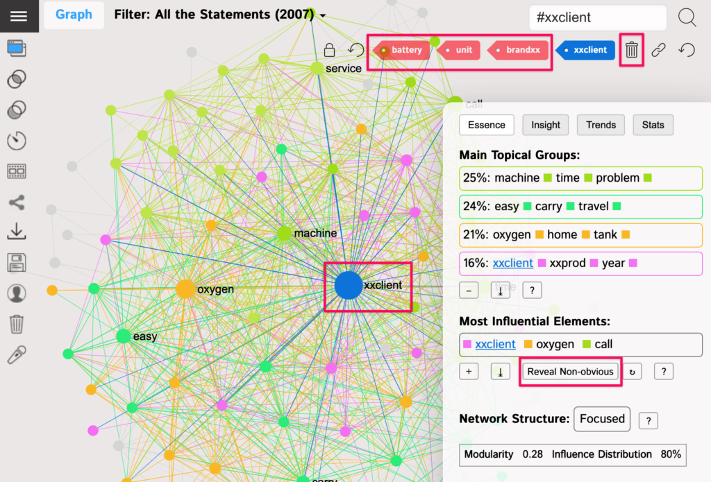
Once we do that, InfraNodus will reveal the latent topics hiding behind the most relevant terms. For example, an important one in our case:
• time, problem, call
Let’s click on that topic to see which context it’s used in. The software will filter out the reviews that contain only those terms. We can see that many customers are not happy with the customer support as they are trying to call the company but are not able to reach it:
Step 6: Zoom Into the Specifics
We can continue the process above and zoom into the specifics by clicking the keywords in the topics identified in the analytics panel to find out more about the context they’re used in.
For example, among the positive aspects of the product, we will find out that
- customers like that the company’s devices are easy to carry and to travel with.
- that they find the machine works great
- that they like the fact that they can leave home with it
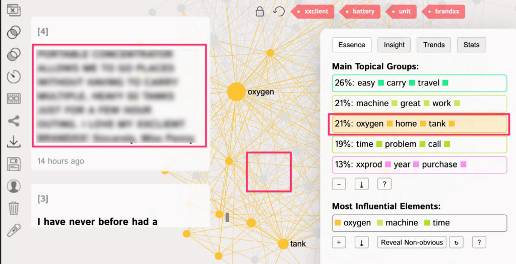
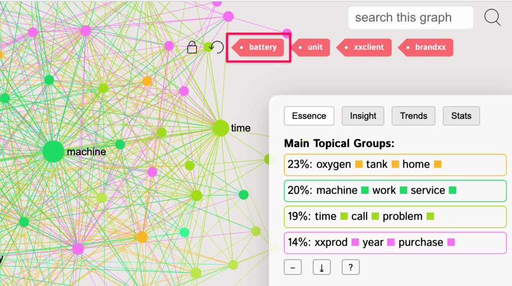
After finishing this step of analysis, we can return the word “battery” into the graph, but keep the rest of the words removed, so we can zoom into the specifics surrounding the various topics identified in the customer feedback.
Step 7: Compare the Positive and the Negative Customer Reviews
Let’s now look at what makes a difference between the 5-star and 1-star reviews. Is it about the product, customer service, or price?
When we imported the CSV file in Step 3, we selected the column with Ratings to be used for categorization. We can now filter the reviews by those ratings using the Statements menu at the top and reveal the differences between the graphs’ structure.
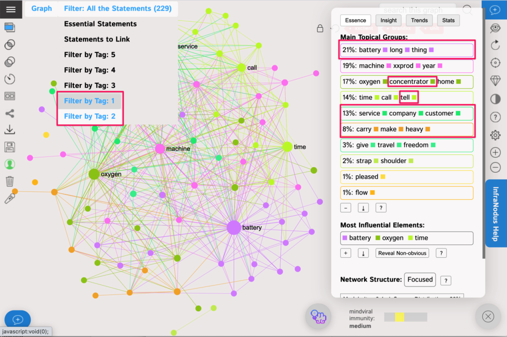
For example, let’s see the graph for the “bad” 1- and 2-star reviews only (of which there are 229 out of more than 2007 or about 11%):
And compare it to the graph with the “good” 4- and 5-star reviews (of which there are 1543 out of 2007 or about 75%):
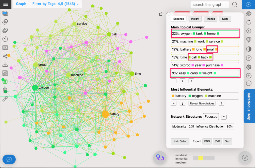
Interestingly, both graphs are quite similar, which means that the main topics (battery life, portability, customer service support call waiting times) are equally present in the “bad” and the “good” reviews. And while there are more positive reviews (75%) than negative reviews (11%), let’s look at the differences, so that we know what makes a bad and a good customer experience.
The main observations are:
- The “long battery life” topic is much more important in the “bad” reviews than in the “good” ones. The company should address the battery life issue to improve the customer experience.
- The “company customer service” topic is present in the “bad” reviews but not in the “good” ones. When people are happy with the company they mention that they get a “call back” (topic 5 in the “good” reviews). When they are unhappy, they mention the bad customer service experience in quite a few cases (and tell others about it). So customer service has to be improved and people are not happy when they have to wait too long on a call and they are happy when they get a get a “call back”.
- People are happy about the portability of the product in the positive customer reviews but are not happy about having to carry stuff with (and for) the machine in the “bad” ones. Perhaps the company could address this issue with the next design iteration.
- The top topic in the high-rating reviews is the “oxygen tank home” — the customers are happy to use the product both outside of home as well as inside. This feature makes them happy and could be amplified in the marketing message.
- The “negative” reviews reveal a separate topic “shoulder strap“. A closer review of these keywords reveal that there is indeed a problem with the shoulder strap (it slips and is not comfortable), which is even present in the positive reviews.
The best approach is to reiterate this process and play around with the graph. For instance, you can select only the 5-star reviews and only the 1-star ones, comparing the differences. You can also return the removed words back into the graph to see if there are any other topical clusters revealed as a result.
Step 8: How can the Customer Experience be Improved
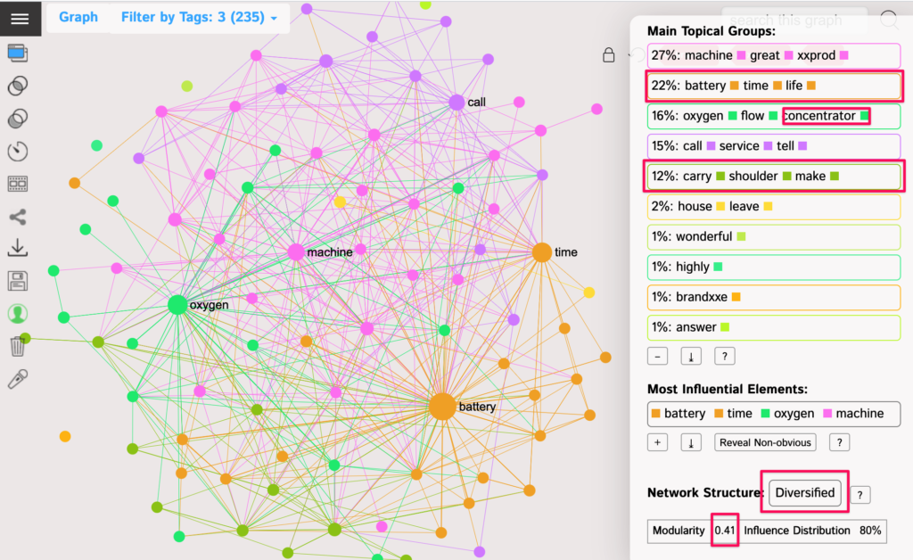
Another question we can explore is how we can win over the customers who didn’t rate the product so highly. Let’s compare the remaining 235 3-star reviews to the 1106 5-star ones and see the differences.
One additional feature of InfraNodus is that you can select a slightly different topical clustering algorithm. By default it chooses the nodes with the highest degree (correlates with frequency). However, you can also choose to show the nodes with the highest influence (intertopical connectivity) as the top nodes in each cluster (in the Settings). That makes it easier for you to find the most “connective” terms.
Here are the 3-star reviews below. Note, that the structure is “Diversified”, which means that there is not just one thing that people are not so happy about.
Here is the graph for the 5-star reviews, the structure is more homogeneous:
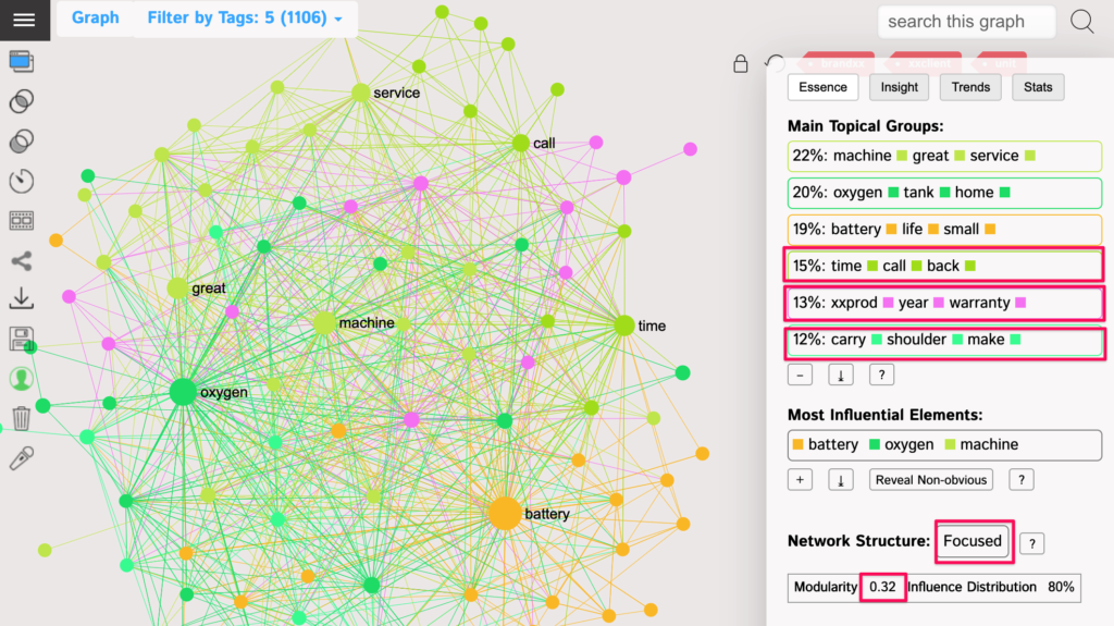
If we compare the two graphs we can see that the strongest push can come from improving the shoulder strap for the product as well as informing the customers about the warranty and the service, while also improving the customer service and reducing the time it takes for the support to call back.
To try this analysis on your own customer product reviews, use https://infranodus.com