Posted by Nodus Labs | November 15, 2014
Twitter xRay Using Text Network Analysis
Text network analysis can be a very useful tool to make sense of Twitter’s ever-expanding newsfeed. It can be used to visualize a user’s feed of tweets or visualize one’s own newsfeed as a network to be able to see what the tweets are about and how they connect. Text network analysis allows to see not only the main terms, but also how they connect, providing the context to the most relevant keywords found on Twitter.
Case 1: Visualize @user’s Tweets as a Text Network
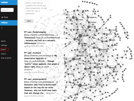
The tweets can be imported using Nodus Labs’ InfraNodus tool. At the bottom left menu there’s an “Import” option in menu, which allows you to choose any Twitter user. We did this visualization for our own Twitter account @noduslabs.
The way the algorithm of InfraNodus works is that every Tweet is processed as a separate statement. The words are represented as a node in the graph and their co-occurrence in the tweet as a connection. The closer the words are, the stronger is the connection between them. The more connections the node (or the word) has, the bigger it is on the graph. Those nodes that are connected together are grouped in clusters.
This way you can see the most often used terms in context, not only focusing on the main keywords, but in which context they occur together.
You can learn more about this text network analysis algorithm browsing InfraNodus open source code on GitHub and reading our paper on text network analysis.
Case 2: Finding the Most Relevant Tweets in the Newsfeed
The same process of transforming the text of the tweets into a network of interrelated concepts can also be applied to a user’s newsfeed.
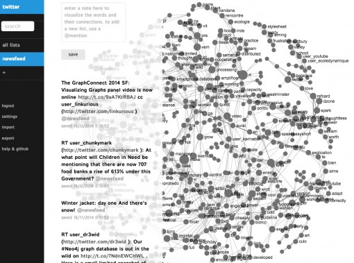
We set the setting of the Twitter import in InfraNodus to show a user’s newsfeed and did a visualization for @noduslabs user Twitter newsfeed.
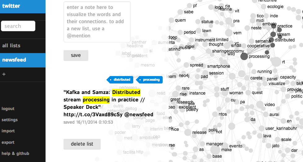
As in the image above, the words that are most frequently occurring in @noduslabs user newsfeed are bigger on the graph. They are also shown next to the terms they co-occur with, providing the context.
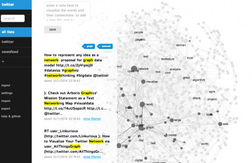
Clicking on one a few of the terms will show only the tweets and the part of the graph with these terms. For example, on the page above we clicked on “processing” and “streaming” and saw the tweet with the URL that has both the terms “processing” and “streaming” inside.
Reading a Twitter newsfeed through the text network allows the user to quickly choose the clusters of terms that are most relevant to them and quickly find the tweets related to their interests.
Case 3: Comparing Twitter Newsfeed Text Graphs
It’s also possible to compare the results from both Case 1 (@noduslabs’ tweets) and Case 2 (@noduslabs’ Twitter newsfeed) to see how the both intersects. This approach makes it possible to evaluate how relevant is the content of a specific user is to the tweets that this user is following.
For our particular case (user @noduslabs compared with their Twitter newsfeed) we see that both are quite well aligned. The terms that the user @noduslabs relates through to the rest of their network are “network”, “graph”, “visualization”, “neo4j”.
A more extended analysis of those two graphs can be performed using graph analysis software like Gephi.
Twitter Hashtag Visualization: Sentiment Analysis
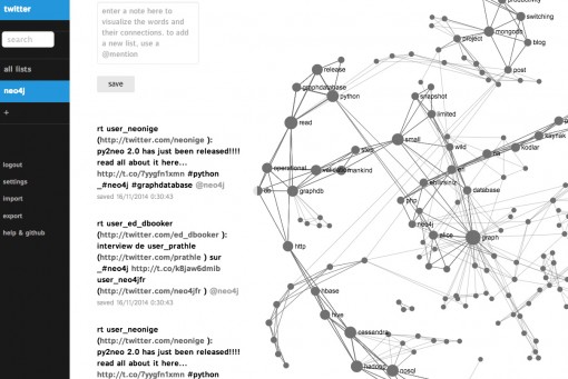
The same approach can be applied to find out about the context of a certain hashtag on Twitter. InfraNodus has #hashtag import feature, which imports the most recent tweets that contains that #hashtag and shows the graph of the terms most often used with this #hashtag in tweets.
It can be seen from the graph above that #neo4j (the graph database InfraNodus is running on) is often used with the hashtags #graph #nosql #graphdb among others.
This kind of analysis can be also used to quickly analyze Twitter user sentiment for a brand or find the context that a certain hashtag is used in.
If you would like to try the above with other Twitter accounts, contact us to get an invitation code to InfraNodus text network analysis app.

