Posted by Nodus Labs | January 28, 2015
Learning through Associations and Knowledge Graphs
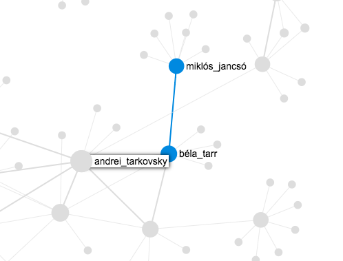
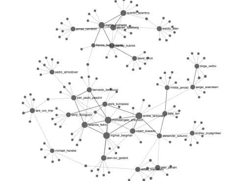
When somebody wants to discover a new film director or a writer, they often start from what they already know and proceed through associations. For example, if you like Anrei Tarkovsky, you might like Bela Tarr – and through Bela Tarr you might discover a less-known Hungarian director Miklós_Jancsó and so on…
People learn about those connections through conversations, personal recommendations, links and citations. The paths that they take to explore knowledge can be very subjective and yet there is a sort of consistency, which can be expressed as a network graph. Such representation is much more flexible than a list of references on a Wikipedia or IMDB page. The main difference is that data represented as a network provides a very good insight about the contexts. A field of practice is represented based on the relationships that it produces – transcending categories and historical timelines.
Besides, such a graph is a great way of sharing this information: just one file with an overview that already gives a good intuitive idea about the various movements and aesthetic languages in cinema. (You might want to read our article about the new network graph formats.)
A digital version of this graph can be embedded on any webpage and enrich the content through providing contextual knowledge:
The data for this particular graph above was aggregated using the Import function of InfraNodus app. Using the data and APIs from search engines, which track the search terms people tend to use together, InfraNodus explores associative graphs connected to entities and helps connect all those bits and pieces of disjointed information together in order to make better sense of it. Below is the video showing the process in more details, from the user’s perspective, this time using philosophy as an example…
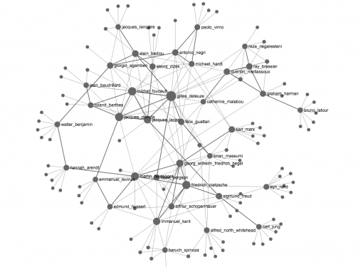
Here we can see the user exploring the graph. As soon as they reach the periphery of their knowledge, they make two clicks and the software automatically retrieves the data that expands their current domain. Gradually a network takes shape, which traces relationships between various philosophers.
The connections within the graph do not only help better understand which philosophers belong to a similar field of inquiry. They also provide an insight about the audience’s preferences. For example, we see a strong link between Nietsche and Freud, which emerged not because they were necessarily similar, but because people who are interested in Nietsche tend to also read about Freud.
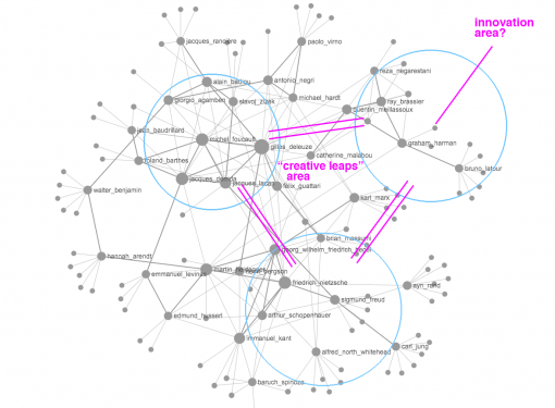
The gaps inside the graph indicate a possible interesting field of inquiry. These are the areas that need to be studied in more detail or where interesting research may come up in the future (similar to the concept of making “creative leaps” described by Noy et al in their very interesting paper published in 2012). The periphery of the graph is the space for the innovation – showing to the one who explores possible paths to expand their knowledge beyond the realms of the current context.

