Posted by Nodus Labs | January 25, 2015
Knowledge Graphs: The New Type of Document for the 21st Century

Excel was a revolutionary product for the time, but in the 21st century columns and rows are not sufficient anymore. The rise of complexity and big data, proliferation of social networks, minification of informational streams make two-dimensional information model insufficient. What matters today are multidimensional relations between data, which combine a better view of the bigger picture with an attention to detail: networks and graphs.
Special thanks to Dor Garbash of Rhizi / CRI and Alexis Jacomy of Sigma.Js for enlightening conversations on this subject.
From Relational Tables to Network Graphs
Text documents and Excel tables are essentially story-telling devices. They are very useful to communicate information in a logical and chronologically coherent way. However, as the digital networks proliferate, complexity of the stories that need to be told also increases. That’s why it makes sense to embrace networks as the new useful story-telling devices.
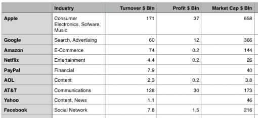
To use a simple example: what would an overview of the high-tech sector normally look like? A standard approach would be to open a list of the top 500 Fortune companies and make a selection, which could be presented as a report or as a table like this:
It’s an informative table, because the data inside can be combined to create a story. For instance, Google is a search engine and it earns 3 times less than Apple, but it costs only twice less… therefore the expectations investors have in regards to Google might be higher than towards Apple, but this needs to be checked with some other data, etc.
This type of story, however, does not reveal how those companies are interconnected. In fact, a two-dimensional table will only be able to tell how A (a row), through a certain criteria (a column), relates to B (another row) and how B, through another criteria (another column), relates to C (the 3rd row), but it won’t tell us that A and B and C relate to D, which is a competitor to E, which is related to F, E and G, who provide services for A and B. Or you’d need several tables – e.g. a relational database and a few complex queries.
That’s where the network graph documents can be very useful. They provide a very simple visual way to represent interconnectedness. Network graphs can be used to provide an overview of an industry, describe inner workings of a terrorist organization, give a good idea about contemporary philosophy or even be used to find the best restaurants in Berlin, based on one’s preferences.
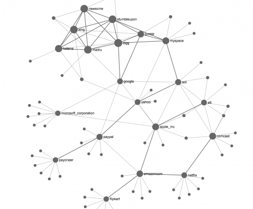
To continue with the example above: to learn about an industry, one could simply visualize connections between the high-tech companies based on some criteria. For example, Google’s “People also search for…” feature offers results based on how often people who search for A also search for B, offering a way to get a bird’s eye view of the industry from the customers’ point of view:
(link to the original network graph document)
This graph shows connections between the main players at the market at one glance. The stories that can be told using this graph are much more diverse and associative than the stories that can be derived from spreadsheets. For example, “people who search for Amazon also search for Netflix and Flipcart, which are all e-commerce enterprises, but also for Apple, which is a competitor to Microsoft, and Apple is connected to AT&T, which is a telecom provider, just like Comcast, through which AOL delivers its content and people who search for AOL also search for Google, which is a search engine that helps people find content, just like Digg, StumbleUpon and Newswine do for news.”
This kind of document gives a much better idea about connections within the industry and offers the new insights that would not be derived as easily from conventional spreadsheets populated with numbers. Also, various tools from graph theory can be used to provide a more readable graphical representation, in order to identify clusters of closely related elements (which are more closely aligned together above using Force-Atlas layout) or to identify the most connected elements (such as Apple and Digg above, which are shown as bigger nodes on the graph, because they are better connected than others).
Describing Relationships: Rich Edges
The network graphs in themselves provide a very good way of seeing the big picture, an overview of relationships. However, there is another essential aspect to networks: the actual descriptions of those relationships. The so-called rich edge data can provide valuable insights about the nature of network graphs and offer additional instruments for building network-based narratives.
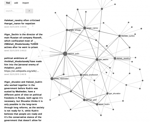
The example below is a network of most prominent Russian politicians, sometimes referred to as “sistema”. The information for the graph has been sourced from various publications, Wikipedia articles and Google search results.
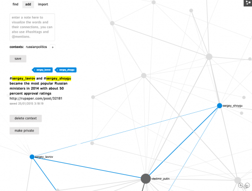
As it can be seen, each relationship is described with a text and most relationships have a source attribution. The graph does not only provide a good overview of who is who in the Russian political system, but also explains every relation, making this graph much more useful for research and investigative journalism:
(open the interactive network graph of Russian political system)
Moreover, such “rich edges graph” can be used to quickly find the information one needs. For example, clicking on the two interconnected nodes “Sergey Shoygu” and “Sergey Lavrov” quickly shows description of the relation between them:
Further Analysis of Network Graphs and Open Formats
One very important aspect of this new rising network graph format is that it’s a type of an XML document, which makes it very easy to port it between platforms and to even read it in any text editor.
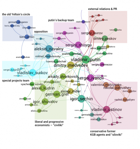
If there is interest to perform a bit more detailed analysis of the network presented above, it can be exported in a .gexf file format and opened in professional network analysis and visualization software like Gephi:
In order to make the graph more readable, we ranged the nodes by degree (the more is the number of connections, the bigger is the node in the graph) and applied Force-Atlas layout, which pushes the most connected nodes apart, while gathering the smaller nodes around them. We also applied Modularity algorithm, which detects communities in the graph, which are indicated with distinct colors inside the graph (nodes that are more densely connected together than with the rest of the network).
The resulting graph is a very powerful narrative device, which can be used to tell a story about the current political system in Russia (or even reveal any other local or global conspiracy). In the example above, it can clearly be seen that Vladimir Putin built a network with several distinct centers, which are connected to each other through him and through the necessity to work together in the government. The alliance within those groups is usually determined by political views (conservative vs liberal) or by the function within the government (energy sector is in the hands of conservative politicians while the banking and finance sectors are in the hands of the more liberal ones). There are also a couple of groups that are responsible for public relations (Putin’s press secretary Dmitry Peskov and the minister of foreign affairs Sergei Lavrov), as well as what we called the “special projects” team headed by the well-known grey cardinal of Kremlin’s politics Vladislav Surkov (who was one of the main architects of the current political network, and was responsible for settling the piece with Chechnya and is allegedly involved in the current struggle in Novorossia – eastern part of Ukraine).
It is interesting that in the Putin’s system the difference between the different centers of influence is maintained through putting together at work people who often have opposing political and economical views. Most staff-related decisions in the Kremlin are often based on balancing the power available to the conservatives and the liberals.
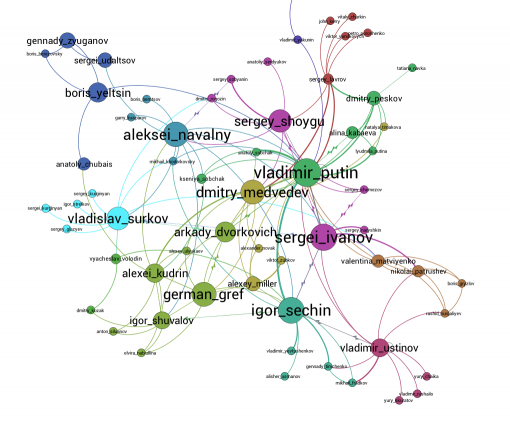
Another interesting feature of network analysis is the ability to detect the most influential nodes in the network: those people who have the highest betweenness centrality connecting the different power groups together. Applying this measure to the graph yields the following results:
It can be seen that both Vladimir Putin and his close ally Igor Sechin have the most brokerage power between different groups. The main opposition leader, Aleksey Navalny, has also positioned himself well into network. His problem, however, while Putin is the one who negotiates some sort of peace between all those different groups, Navalny is instead acting like a weapon that those groups use against each other (through his anti-corruption investigations often leaked from one of the groups), putting him in a much riskier position. However, it has been Navalny’s stance from the beginning that his intention is not to integrate himself into the “sistema”, but, rather to break it apart. However, he would need to build a different network instead of the already existing one first, in order to ensure future development after the old system is dismantled.
Conclusion
In this review we have shown that the network graph documents can be serve as useful narrative devices, augmenting existing formats. The standard text documents, html website pages and spreadsheets are doing a good job in showcasing coherent chronological data. As soon as there is a need to tell a story of interconnectedness and complexity, a different type of documents and story-telling devices are needed. Network graphs can serve very well in this regard: from giving an overview of a certain field of inquiry to providing concrete details for every relation that is part of the big picture.
We would like to thank CRI and Dor Garbash from Rhizi for inspiring conversations on these subjects.
Network Graph Editors
If you are interested to create your own graphs, try:
• Nodus Labs’ InfraNodus graph editor
• Linkurio.Us – Neo4J graph database viz tool
• Gephi graph analysis and viz software
• Sigma.Js library for sharing graphs online
• Rhizi collaborative graphs platform
• Cograph graph sharing platform
• Metamaps collaborative tool to map relations
(click on the graph button at the top right corner to view the graph)
If you know and can recommend more tools like this, please, leave your comments below!
PS: What about the Mind Maps?
It is important to mention why we did not include mind maps in this review. The reason is that mind-mapping is often just another way of organizing data in an hierarchical way. Most mind maps start from the central concept and progress in a star-like manner towards the periphery. Such maps often serve as visualization of the existing categories and do not have the tools that graph theory has to use various metrics in order to detect communities, the most influential nodes, etc. Another important aspect is that very few mind maps have detailed descriptions of the relations between the nodes. At most there will be some overlayed ontology that describes a type of connection, simply adding an extra layer of complexity. That’s why Mind Maps provide a good overview of connections between the entities, but do not really allow to deal with complexity that arise in networks. It’s impossible to do further processing on the mind map and detect communities, the most influential nodes, and, most importantly, describe detailed relationships between those nodes in a readable way.

