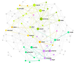
Posted by Nodus Labs | December 25, 2011
Network Analysis of Russian Protest Groups on Facebook using Gephi and Netvizz
In this post we will demonstrate how one can analyze any Facebook group or profile using a combination of freely available tools. We will take as an example the recent Russian protest movement against rigged elections. Recently there have been many groups popping up on Facebook bringing people together around certain goals and tasks of the movement: self-organized activist groups producing promo materials, singing petition against Vladimir Putin, organizing demonstration for fair elections in Berlin, Germany.
Client: Russian self-organized movement for fair elections.
Objective: Identify the structure and key influences of the main protest groups on Facebook.
We started our analysis from the two main questions: 1) how does the structure of these groups affect their ability to successfully fulfil their objectives; and 2) what kind of people exert the most influence within these groups. Visualizing the group as a network and identifying the most prominent communities and the most influential members can answer both of these questions. It can also indicate the possible strategies for strengthening or weakening these groups and finding the main points of entrance: the people and clusters within the groups that should be addressed in order to communicate a message to the group in a fast and efficient manner.
The first step is getting a GDF file (GUESS graph data file) generated from the Facebook group. This file lists the members (nodes) of the group and the connections (edges) between them. This file can be generated by the netvizz Facebook app (authored by Bernhard Rieder) for the groups that you are a member of. Activate the app, join the group you want to analyze, go back to the app, select the group, wait a few minutes, and the GDF file will be generated (you should download it to your computer). The app does not always work very well and you can only create the file for the groups that have no more than 1500-2000 members. Otherwise the processing takes too long and the app fails.
The next step is to open the file in Gephi graph visualization and analysis software. It’s a free, open-source, and cross-platform application developed by the Gephi Consortium that Nodus Labs is also a member of. Gephi is a great and easy-to-use tool. It has a lot of knobs and parameters that you can set, but their tutorial will give you a quick intro in 5 minutes, so it’s highly recommended to try it out if you haven’t used Gephi yet.
Once you install and open Gephi, open the GDF file with the network data for the group you want to analyze. It will look something like this (Fig 1):

Fig 1: Facebook group "Putin should leave" - random node layout in Gephi
Note, that we cannot provide the actual GDF file we’re using as it contains sensitive private data, but you can get it if you join the group “Putin should leave” and then generate your own version using netvizz.
The next step is to apply produce a more meaningful visualization of this data by applying Force Atlas layout (in the Layout pane at the left bottom choose “Force Atlas”, set the parameters like on Fig 2 below, and click “Run”). This layout pushes the most connected hubs apart from each other and positions the nodes connected to them in clusters around the hubs, producing a much clearer view of the community. Click “Stop” and then calculate the main metrics for the graph by clicking “Run” next to “Avg. path length” in the “Statistics” pane in the right sidebar. Finally, go to the “Ranking” pane at the top right corner, choose “Nodes” tab, click on the second icon from the left (Node size adjust), choose “Betweenness centrality” from the list, set the min. and max. size and click “Apply”. The nodes will be ranged by their betweenness centrality, which is a measure of the node’s influence in the network showing how often it appears on the shortest path between any two randomly selected nodes in the network. In other words, if a node has a high measure of betweenness centrality it’s responsible for connecting disparate groups in the network together and thus can exert higher influence on the overall structure. You will get an image below (Fig 2):

Fig. 2: Facebook group visualization in Gephi
The final step is to make the community more visible by calculating modularity measure. Modularity shows the clusters of nodes that are more densely connected together than with the rest of the network. Click “Run” next to the “Modularity” field at the right Statistics pane. Then go to the “Partition” pane at the top left, click “Nodes”, the green “Reload” button, and then choose “Modularity” from the list and click “Apply” (see Fig. 3). Note, that your image may be different from the ones we show below as the modularity algorithm and Force Atlas layout do not produce the same results all the time, as it’s both iterative algorithms and depending on the particular settings you choose and the network configuration you select the results may be different, although generally consistent.

Fig. 3: Facebook group Gephi visualization: community structure and the most influential hubs
Now that we’ve visualized the group, you can turn on the text display by clicking the “T” button at the bottom of the graph and adjusting the size of the text with a slider. We will now show the names here for privacy concerns, however, it doesn’t matter for our further analys. Let’s look closer at this Facebook group “Putin must leave”.
The clusters where the participants are more densely connected together than with the rest of the network are indicated with a specific color. The nodes that have more influence in the group are bigger (they are the ones with the highest betweenness centrality – occurring most often on the shortest path between any two randomly chosen nodes in the group – in other words, connecting the clusters together).
We excluded the names for privacy purposes, but the most influential members of this group are the scientists, journalists, political activists and the people from media and creative professions. There’s also a prominent group of Georgians in this graph. The four biggest clusters comprise about 50% of the group’s members. The largest one (magenta on the graph) is very densely connected, making it one of the faster groups to take on and spread any incoming message to the rest of the group’s communities.
In total there are 1809 participants (nodes) and 5358 connections (edges) in this group. The average path (the number of people to reach from one randomly selected member to another) is 3.7 (so the clusters in the group are pretty well connected) and the average number of connections each participant has is 5.9 (so on average everyone in the group knows about 6 people from that group). Clustering is 0.194, graph density is 0.003 (very low). There are about 58% of people in the group who are not Facebook “friends” with anyone else from the group. This makes it much more difficult to communicate information to them and if the group was to become more active it would have to integrate these “loners” into the already existing clusters and encourage them to form their own. Even the Facebook’s algorithms push those news at the top, which are “liked” or shared by the immediate surrounding of the person, so more interconnectedness would result in more visibility for this group.
The next Facebook group we analyzed is called “Meeting for fair elections. Activist and volunteer movement” (Fig. 4) – main task is to gather together the activist who want to produce and distribute materials, be observers at the next elections, and do the real day-to-day work to support the movement.

Fig. 4: Facebook volunteer group network visualization in Gephi
The clusters where the participants are better connected between each other than to the rest of the groups are indicated by their own distinct color. There are three main groups, including 12% (violet), 10% (green) and 9% (light blue) of the nodes respectively. The most influential participants (the nodes with the highest betweenness centrality that appear often on the shortest path between two any randomly chosen nodes in the network) are shown bigger on the graph. It can be seen that each cluster has several influential members, so they are not lead by one person and the interaction between clusters is quite good (they are connected together).
Overall the group has 290 participants (nodes) and 695 connections (edges). The average degree is 4.8 which means that on average a member of this group is Facebook friends with 5 other people who are also part of this group. The average path (distance between any two nodes in the network) is 3.2, which is relatively short, meaning that the clusters are well-connected. The clustering coefficient is 0.219 (which is similar to Путин должен уйти group), but the graph density is much higher: 0.017, meaning that this group is better interconnected and thus is also better in propagating information to the whole network (although the life-time of message would be shorter than in the less densely connected group). About 45% of members are not friends with anyone else from the group, so that could be a hint for the active volunteers to involve these “loners” and help them get to know each other. In case they are connected to the existing clusters or form their own, information will propagate much better in this network, as Facebook’s own algorithms give preferences to communication that’s “liked” and shared by the person’s immediate surrounding.
We excluded the names of the people from this visualization for privacy, however, the most active nodes are mainly media professionals or people who run small businesses, so it’s significantly less politicised than the other group we analyzed (Putin must leave). Overall it’s interesting to observe that a group formed around specific action (volunteering for fair elections and material production) is much less politicised and better connected (and is thus more efficient in proliferating information) than a group that has a clear political message (Putin must leave). However, the “advantage” of the other group is that it has a densely interconnected cluster within, which are known to be very efficient for brining networks to action. Perhaps, the volunteer group could benefit from letting its members know each other and also from forming more links between the nodes at the periphery. That would make them much stronger and efficient in their communication.
Finally, the last group we analyzed is called “For Fair Votes (in Germany)”, which is responsible for organizing the meetings in front of the Russian embassy in Germany (Fig. 5).
")
Fig. 5: Facebook group visualization using Gephi - For Fair Votes (in Germany)
The clusters of different colour represent the participants that are more densely connected to each other than to the rest of the network. There are 4 main clusters that accumulate 16% (purple), 13% (magenta), 10% (light blue), and 9% (light green) of participants accordingly. The most influential members of the group are shown as bigger nodes on the graph. They have a higher measure of betweenness centrality, appearing more often on the shortest path between two randomly chosen nodes in the networks (connecting communities together).
There are 472 members (nodes) in this group and 1135 connections (edges) between them. The average path length is 3.4 (everyone in the group can reach anyone else in about 3 steps), average degree is 4.8 (every member of the group is already friends on Facebook with about 5 other members of of the group). Therefore, the network is quite well-connected and is similar to the networks we reviewed above. Graph density is 0.01 (more than the anti-Putin group but less than the volunteer group above) and clustering is 0.281, the highest of the 3 groups we’ve reviewed here (but not significantly different). About 42% of this group’s members don’t know anyone else from the group, which means that it takes longer for information to reach them: Facebook tends to promote the news that are “liked” or “shared” by the person’s immediate neighbours in the network. At the same time, it’s a lower number of “loners” than in the other group, which means that this network is much better connected and is more conducive to information propagation. In order to increase connectivity and its informational potential, the existing groups and members should do what they can to (at least virtually) meet those who don’t know anyone in the network yet and integrate them into their communities. It’s also important that currently each group has at least a few influential members, meaning that they are quite equal in the amount of influence they can exert on the network and for the sake of group’s development it’s good to keep it this way. It can be done by introducing the members at the periphery of each cluster to each other and also if the main hubs start introducing their own Facebook friends to each other as well. That will help to keep the network open and dynamic and ensure that it’s sustainable and open to the new influences.
Regarding the actual members of the groups whose names are not shown for privacy reasons, the key members are involved in event organising, science and research, and various minor group activist organisations (e.g. the rights of gays and lesbians). Its structure is not driven by politics or ideology: most of the people are just those who at some point left Russia in order to be able to work and protect their rights.
We hope that this analysis was interesting for you and please, don’t hesitate to send us any questions or comments.